Ranter
Join devRant
Do all the things like
++ or -- rants, post your own rants, comment on others' rants and build your customized dev avatar
Sign Up
Pipeless API

From the creators of devRant, Pipeless lets you power real-time personalized recommendations and activity feeds using a simple API
Learn More
Comments
-
Our client wanted a swoosh sound when the website loaded. And also wanted the loading screen to be delayed so that they could see the tea being poured completely (loader).
Also, no textured background. And a map that won't be responsive.
The map which is not great would "make or break the site for them"..... Their words.
I blame the person posting before me
Related Rants
-
 bjorngi26
 The aCalendar app let's you choose vibration pattern, it's one of the better settings I've seen.
 -
 aswinmohanme17
 When you take User Experience to the next level. Just what I was thinking
Credits : Riot App
 -
 htlr79
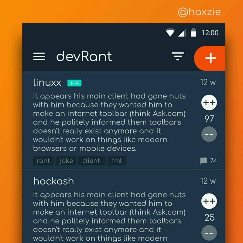
 Been looking around ways to improve devrant's user experience a little, Idk whether you guys like it or not.. ...

Has anybody noticed some people's undying obsession with making their 2018 websites look like they're from 2001? Some of our clients INSIST on using site entry pop-ups, scrolling marquee text, and as many flashing buttons as possible on their sites. These are the type of people who think: "The number of buttons on my website directly correlates to the amount of money my site makes me. I want 12 buttons, all worded slightly differently, that all link to the same exact page. This will sell more of my product. From all of my experience in UX, I am positive that users will respond to a flashing neon colored button labeled "SAVE NOW!!!!!" Nevermind that your company employs professional UX Engineers. I know more than them."
rant
ux fail
ux